
KookiiWP
Your WordPress confidence—cookies never need be. boring again.
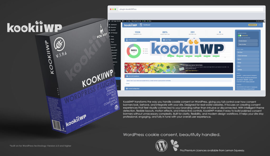
KookiiWP is a designer-focused cookie consent plugin built specifically for WordPress, created to make consent banners feel like a natural part of your website rather than an intrusive add-on. Instead of relying on generic layouts and disconnected styling, KookiiWP automatically reads your theme colours and WordPress Global Styles to create banners that visually integrate with your site from the moment they appear.
Designed with both aesthetics and usability in mind, KookiiWP gives site owners, designers, and developers full control over how consent is presented. The interface is structured into clear sections covering content, layout, motion, character styling, statistics, and settings, making it easy to build a banner that matches both your branding and user experience goals. From minimal bars to floating cards, modal overlays, and animated drawers, every layout is built to feel polished and intentional.
At its core, KookiiWP focuses on intelligent visual integration. The plugin automatically detects theme palettes through CSS variables and WordPress Global Styles, reducing the need for manual colour matching and helping banners blend naturally into modern themes. Every visual element can still be customised individually, including backgrounds, text, accent colours, corner radius, animation behaviour, and collapsed states.
KookiiWP also introduces a unique animated mascot system called Kookii. Available in the Pro version, the Kookii character appears alongside the consent banner using locally hosted SVG animations powered by SVGator and Anime.js. The character reacts to user interaction, supports multiple visual flavours, and integrates directly into the banner’s collapse and morph animations, adding personality and motion without relying on external animation services.
Beyond design, KookiiWP includes built-in consent tracking and visual analytics tools. Pro users gain access to consent overview charts, interactive world maps, per-page consent breakdowns, and device analytics, all stored locally within the site’s own WordPress database. No external tracking services, remote dashboards, or third-party analytics platforms are required.
Performance and simplicity remain central to the plugin’s approach. All libraries are bundled locally, no CDN calls are made, and no personal data is stored in consent logs. KookiiWP is designed to run efficiently while giving developers and site owners practical tools for modern consent management without unnecessary overhead or complexity.
Whether you want a subtle consent notice that quietly fits your site or a more animated, character-driven experience with interactive motion and analytics, KookiiWP provides a flexible, design-led workflow built for real-world WordPress projects.
Key Features
- Theme Colour Auto-Detection – Automatically reads WordPress theme colours and CSS variables.
- Multiple Banner Layouts – Choose from Bar, Card, Modal, or Drawer layouts.
- Advanced Motion Effects – Smooth entrance animations powered by Anime.js spring physics.
- Custom Styling Controls – Adjust colours, corner radius, collapse states, and layout behaviour.
- Kookii Character System (Pro) – Animated SVG mascot with interactive motion states.
- Collapsed Blob Modes – Morph banners into persistent floating consent controls.
- Consent Analytics (Pro) – View acceptance, decline, and dismissal statistics visually.
- World Consent Map (Pro) – Interactive country-based consent tracking.
- Per-Page Breakdown (Pro) – Identify consent behaviour across different pages.
- Device Analytics (Pro) – Compare desktop, mobile, and tablet consent activity.
- EU / UK Targeting (Pro) – Display banners only to relevant visitors.
- Lightweight & Local – No external API calls, CDN dependencies, or remote tracking.
- Privacy Focused – Stores no personal visitor data or IP addresses.
- Designer-Led Workflow – Built to prioritise appearance, usability, and integration.
- Professional WordPress Integration – Structured controls designed for developers, designers, and agencies.
Requirements:
- Minimum WP Version: 6.0
- Minimum PHP Version: 7.4
- Internet Connection
- Free Version or Valid Licence for Pro Version
*Please note this plugin has the following built in languages: English
Plugin News
Happy to say we are in the process of making and deploying a dedicated support hub. Stay tuned for more details. Their will be links posted in the plugin as well as any known locations.
KookiiWP continues to evolve as a modern approach to WordPress cookie consent and privacy management, focusing on design integration, flexibility, and real usability inside the admin environment. As consent systems become a standard part of modern websites, KookiiWP is positioning itself beyond traditional compliance-only plugins by combining intelligent theme styling, animated interactions, consent analytics, and user experience controls into a single streamlined interface.
Recent development has focused on improving visual integration and workflow flexibility, giving users greater control over how consent banners look, behave, and interact with visitors across different devices and layouts. With ongoing expansion into advanced animations, smarter theme detection, enhanced analytics, and interactive character systems, KookiiWP is steadily moving toward a more design-driven approach to privacy management—bridging the gap between compliance requirements and modern website presentation.
Changelog/Bugs
Changelog
KookiiWP - Version History
Version 1.4.92 Minor
2026-05-10- ### Design page — Basic tab restructure
- - **Typography card** — two-column layout: text alignment (Left / Centre / Right) on the left; Pro controls (heading size, body size, button size, text transform) on the right with a Pro badge; Right align option added
- - **Colours card** — existing pickers unchanged; added HR divider then Gradient Background (Pro) below: enable toggle, colour-stop count (2/3/4), individual stop pickers that show/hide based on count, and angle slider
- - **Styling card** — two-column layout: Corner Radius (free) on the left; all Pro controls (button radius, border style/width, drop shadow, button style, inner padding, element spacing) on the right with a Pro badge
- - **Settings** — added `text_transform`, `gradient_enabled`, `gradient_stops`, `gradient_color_1/2/3/4`, `gradient_angle` to defaults and save function; `text_align` now accepts `right` as a valid value
Version 1.4.91 Minor
2026-05-10- ### Bug fixes & UX
- - **Checkbox save fix** — unchecking any toggle (blur, mascot, dismiss, branding, revoke, categories, policy links) now correctly saves `0`; previously unchecked boxes were silently ignored and the old value persisted
- - **Blur BG toggle** — modal backdrop blur now updates live in the design page iframe without requiring a save; `kkw_blur` URL param passed through preview reload
- - **Policy link preview** — admin mini-preview now hides policy links when URL field is empty, matching live banner behaviour; preview also updates in real time as URL is typed or cleared
- - **Collapse morph positioning** — morph-up now targets the banner\'s correct layout position (bar flush bottom/top, card/drawer in their corner) rather than always centring; morph-down targets the configured blob corner from `collapseMode`; drawer morphs flush with no margin; all settings read from `cfg` passed by `banner-core` so no timing issues
- - **Blur toggle save** — fixed toggle jumping back to ON after saving OFF
- ### Admin animation thumbnails
- - New mini-thumb SVGs wired for Morph, Tilt, Pendulum, Jello in the Pro modal animations section
- ### Mode tiles — behaviour gating
- - Selecting **Standard** mode disables Pro animation tiles in the Motion tab; clicking a greyed tile shows a toast prompting a mode switch
- - Selecting **Dynamic (Pro)** unlocks Free + Pro animations
- - Selecting **Full Kookii (Premium)** unlocks everything including Character tab
- - Mode restriction applied on design page load from saved `banner_mode` setting via `kkwAdmin.bannerMode`
- ### Upgrade modal & licence gating
- - Clicking locked Pro/Premium mode tiles (when not licenced) shows an upgrade modal with tier-appropriate messaging and purchase link
- - Lock emoji replaced with `lock_blue.svg` across mode tiles and animation tiles
- - Character tab shows a premium gate with description and upgrade CTA when not on Premium licence
- - `kkwAdmin` now exposes `isPremium`, `purchaseUrl`, `lockIconUrl`, `bannerMode`
- ### Sidebar
- - \"View Live Site\" button renamed to \"Visit Live Site (No Banner)\"
- - Added note explaining banner is hidden for admins; use Preview Banner or incognito window
Version 1.4.86 Major
2026-05-10- ### Collapse-to-blob morph (foundation work)
- - Standalone `collapse-morph.js` module that morphs the cookie banner ↔ a small \"blob\" with a cookie/info icon
- - Inline cookie & info SVG paths embedded in the script — fill colour driven by `--kkw-bg` so the icon adapts to any theme
- - New settings: `blob_radius` (0–50, controls roundness) and `blob_size` (36–96 px diameter)
- - `isPro` flag passed through to public settings so Pro vs Free behaviour can branch in the frontend
- - `?kkw_blob_only=1` URL flag suppresses the banner output for isolated morph testing
- - Default test scenario: banner opens → user clicks Accept/Decline/Dismiss → banner fades, morph element snaps to its rect → smooth tween to corner blob → click blob → reverse morph back to banner shape and reveal content
- - Both directions use pixel coords throughout (no `auto` switches mid-transition) — no jumps, no snap-backs
- - Banner buttons rewired to trigger the morph-down sequence instead of the regular fade-out
- - Production wiring (per-layout positions, persistence, Pro/Free split) deferred — this commit lays the working morph mechanic
Version 1.4.61 Minor
2026-05-10- ### Modal categories panel — slide-down sub-panel
- - Categories panel inside the modal layout now breaks out of modal padding and renders as a tonally-distinct sub-panel (8% lighter bg) with stronger top border and matching bottom corner radius
- - Open animates a translateY(-12px) → 0 slide combined with maxHeight expansion — feels like the panel is emerging from beneath the modal
- - Close reverses both: translateY → -12px and maxHeight → 0 with the modal re-centring vertically as it shrinks
Version 1.4.59 Minor
2026-05-10- ### Categories panel close animations
- - All four layouts now animate cleanly closed in addition to open — no more snap to gone
- - Modal: categories panel maxHeight collapses + opacity fade + modal re-centres as it shrinks
- - Card / Drawer (left/right expand): panel fades, then card width animates back to original via reversed two-phase
- - Bar / generic inline: panel maxHeight slides up + opacity fade
Version 1.4.57 Minor
2026-05-10- ### Card categories — column reveal layout
- - Card stretches to viewport width (with margins) when categories open — Column 1 keeps natural top-down flow, Column 2 (categories panel) absolute-positioned next to it so it\'s not stretched by row heights
- - Categories list inside the panel uses CSS `column-count: 2` (with `display: block` override on `.kkw-cat-list`) — all four categories visible side by side without vertical growth
- - Heading + Accept All / Save & Close share the top row via grid-template-areas
- - Tightened category row padding (4px head, 6px body) for compact display
- - Theme-aware separator colour: `color-mix(in srgb, var(--kkw-text) 50%, transparent)` for both the column rule and col 1/2 divider — adapts to any banner bg
Version 1.4.50 Minor
2026-05-10- ### Card morph for inline categories
- - Card stretches to full viewport width (capped at viewport-40px) when categories panel opens, anchored to its corner position
- - Two-phase animation: width grows first, then panel fades in and card height grows to fit
- - Auto direction picker for Card layout: bottom-right→left, bottom-left→right (column 2 reveals away from the anchor edge)
- - Inner uses CSS Grid with `grid-auto-rows: max-content` so column 1 stays in natural flow without being stretched
Version 1.4.45 Minor
2026-05-10- ### Categories panel — child modal mode (Bar layout)
- - New \"Child modal\" display mode for cookie categories: panel detaches from the inline expand and renders as a centred floating modal with backdrop
- - Reuses the same accordion + toggle UI from inline mode
- - Click backdrop, × close, or Save & Close to dismiss — panel returns to its original DOM position cleanly
- - CSS variables (`--kkw-bg`, `--kkw-text`, `--kkw-accent`, `--kkw-radius`) explicitly copied from the banner to the panel when moved to body so theme stays consistent
Version 1.4.42 Minor
2026-05-10- ### Categories panel — inline expand (Bar layout)
- - New `kkw-categories-panel` element rendered between policy links and branding when category toggles are enabled
- - Manage Preferences button toggles the panel: smooth maxHeight + opacity slide-down
- - Each category row is an accordion: click row to expand description, separate toggle on the right for consent state
- - Toggle ON reveals the description body automatically; OFF hides it
- - Necessary/Essential always on, locked. Analytics/Marketing/Preferences each conditional on per-category settings
- - Footer: Accept All (gold) and Save & Close (outlined) — Save & Close persists per-category state to cookie as JSON
- - Revoke pill repositions automatically when panel opens, closes, or any category accordion expands
Version 1.4.40 Minor
2026-05-10- ### Manage Preferences button — customisable label
- - New `manage_label` setting (defaults to \"Manage Preferences\") stored, sanitised, exposed to public JS
- - Banner page → Categories tab → \"Manage Preferences button\" field with five pill suggestions: Manage Preferences / Customise / Cookie Settings / Choose Cookies / My Choices
- - Live updates the admin preview pill and the live banner button as user types
Version 1.4.38 Minor
2026-05-10- ### Three policy links + bullet separators
- - New settings: `terms_url` + `show_terms_link`, `cookie_policy_url` + `show_cookie_policy_link` (Privacy was already there)
- - Banner page → Content tab now stacks all three link configurators (page picker + URL field + visibility toggle) tightly under each other
- - Frontend banner output renders the visible links with a `•` separator between them — first visible link gets `.kkw-policy-first` class via JS so it skips the bullet pseudo-element regardless of order
- - Live admin preview mirrors the same bullet behaviour with a JS sync function reading directly from the checkbox states
Version 1.4.34 Minor
2026-05-10- ### Scan history table
- - New `wp_kkw_scan_history` DB table — captures theme name, version, status, high/medium/low/total counts, full results JSON, scanned timestamp
- - Capped at 20 rows automatically — oldest pruned on insert
- - Auto-runs on `plugins_loaded` if `kkw_db_version < 1.1` (handles existing installs without re-activation)
- - Scan page gains a History card: 10 rows visible, scrolls to 20, sticky header
- - Each row shows date, theme + version, colour-coded H/M/L/Total counts, individual × delete button
- - Card header has a `clean.svg` Clear All button (disabled when history is empty)
- - Hitting \"Scan Now\" archives the previous scan to history before running fresh; page reloads to refresh history
- - Identifier-safe SQL: all raw `$wpdb->query/get_results` use `$wpdb->prepare()` with `%i` (WP 6.2+) — bumped `Requires at least: 6.2`
- ### Tracker pattern library expanded
- - 23 patterns → 63 patterns. Sections: Analytics (12), Marketing/Pixels (13), Behaviour/Session (7), Email/CRM (5), Embedded Content (8), Live Chat (7), Error Monitoring (5), Payments (4), A/B Testing (3), Fonts (2), WP/Woo (2)
- - Added: TikTok Pixel, Snapchat, Pinterest, Reddit, Bing UET, Mixpanel, Amplitude, Cloudflare Insights, Yandex, Mailchimp, HubSpot, Klaviyo, ActiveCampaign, ConvertKit, Spotify, SoundCloud, Stripe, PayPal, Optimizely, VWO, Sentry, Bugsnag, LogRocket, etc.
- ### Static security/quality fixes
- - Translators comments moved to be directly above each `esc_html__()` call
- - `$preview_url` wrapped in `esc_url()` (was unescaped on iframe `src`)
- - readme.txt Stable tag now matches plugin version
Version 1.4.31 Major
2026-05-10- ### Pro modal animations
- - **Morph** — accent circle pops in centre-screen, morphs to modal\'s exact dimensions, X-flip reveals modal content (pop + morph + flip)
- - **Tilt** — perspective-skewed entry from top-right corner with a wrapper div providing scoped 3D space (no body-wide perspective leak)
- - **Pendulum** — top-hinge swing-in with anime.js spring (mass:2, stiffness:40, damping:4) for a slow, oscillating settle
- - **Jello** — quick fade-in then horizontal squish-stretch wobble matching Animista `jello-horizontal` keyframes
- - **Reveal** — `scaleY(0)` blind drop from top edge (modal) or bottom edge (drawer)
- - **Ellipse** — `slide-in-elliptic-right-bck` Animista pattern with perspective wrapper for proper 3D arc
- ### Pro card animations
- - **Roll** — position-aware roll from the opposite side of the card\'s resting corner, with `1080°` (3 full turns) of rotation across screen width
- - **Fall** — drop from top of viewport with multi-bounce settle (Animista `bounce-in-top` 65/28/8 px ratios) — chained CSS transitions matching the original keyframe percentages
- - **Flicker** — pure opacity flicker via injected `@keyframes` (Animista `flicker-in-1` pattern) — works on Card, Modal, Drawer
- - **Pop / Pop Flip** — spring scale + accent face flip (1.4.9, refined)
- ### Pro drawer animation
- - **Corner** — diagonal slide from the corner the drawer rests at, with anime.js spring bounce
- ### Cookie icon inside accent face
- - Pop Flip and Morph now show an inline cookie SVG inside the accent-coloured face during the morph
- - SVG fill driven from `--kkw-face-icon` setting → falls back to `--kkw-bg` so it always contrasts against the accent
- - Morph specifically grows the icon from 32px → 80px in sync with the circle morphing to modal shape
- ### Animation thumbnails
- - Mini-thumb SVGs swapped in across all animations: anim-halt, anim-spring, anim-wobble, anim-pop, anim-spin-pop, anim-roll, anim-drop, anim-flicker, anim-flip-x, anim-flap-x, anim-stamp, anim-blinds, anim-rain, anim-slide=pop
- ### Premium animation divider
- - New \"Premium\" badge divider after the Pro animations in the Motion tab
- - Note paragraph: \"Premium motion effects are powered by Kookii Animation. Configure your animation character, icon colour, and behaviour in the [Character tab] to match your site\'s style and tone.\"
- - Tab link click handler in admin-core.js — `.kkw-tab-link[data-tab=character]` jumps to the Character tab without form submit
- ### Sidebar — Motion & First Impressions
- - Design page sidebar adds a Motion section below Theme Harmoniser explaining how a well-chosen animation feels premium, layout-aware Pro animations, and how speed signals brand tone
Version 1.4.10 Minor
2026-05-09- ### Bar layout redesign — two-column grid
- - Bar moves from horizontal squish to a 2-column 4-row grid: Heading top-left, Body row 2 left, Buttons row 2 right, Policy links row 3 right, Branding full-width row 4 centred
- - Branding gets a subtle dividing border above and stays anchored at the bottom regardless of inner expansion
- - Buttons stay on a single row at desktop widths (`flex-wrap: nowrap`) — wrap allowed only below 600px
- - Card layout bumped to 480px wide with 22×26px padding — keeps Accept All / Manage Preferences / Decline / Dismiss on one row
Version 1.4.9 Minor
2026-05-09- ### Card animation — Pop Flip (Pro)
- - Card pops from scale 0 → 1 with elastic spring overshoot — accent colour face covers content during the pop
- - Brief pause at full size, then rotateY flip: accent face has `backface-visibility:hidden` so it vanishes at the midpoint, revealing the real banner content on the back
- - Flip uses two-phase easing: ease-in to the 90° midpoint, ease-out from -90° to 0° for a natural card-turn feel
- - `perspective` applied inline on the banner transform — works correctly on `position:fixed` elements
- - Accent face removed from DOM at the flip midpoint to keep the tree clean
- - Wired to `$allowed_anims`, settings whitelist, and design page Pro tile (card layout only)
Version 1.4.8 Minor
2026-05-09- ### Bar animation — Rain/Rise refinements
- - Slat container kept alive until clip-path wipe completes — eliminates flash between slats disappearing and banner becoming fully visible
- - Fixed slat direction: bottom bar slats fall from above, top bar slats rise from below
- - Fade-in and fall now use a single combined CSS transition so neither cancels the other
- - Fisher-Yates shuffled launch order — slats appear at random column positions, not left-to-right
- - Inter-launch gap 45% of minDur so each new slat appears while the previous is mid-fall
- - vSlow/vFast speed values fixed globally — `sanitize_key()` was lowercasing camelCase values; replaced with `sanitize_text_field()` in banner-output.php
Version 1.4.7 Patch
2026-05-09- ### Bar animation — Rain / Rise
- - 10 solid-colour slats fall from a randomly scattered start point ~25% of viewport away from the bar (±12% jitter per slat so the starting line is ragged, not straight)
- - Launch order is Fisher-Yates shuffled — slats appear at random column positions, not left-to-right
- - Inter-launch gap is 45% of minDur so each new slat appears while the previous is roughly halfway through its fall
- - Each slat fades in and falls simultaneously via a combined CSS transition (`opacity` + `transform`)
- - Fall durations randomised within 1.0–1.6× `duration` so slats land in a loose wave
- - Once the last slat lands, a left→right `clip-path: inset()` wipe reveals the real banner content
- - For `top` position the slats rise upward — animation name doubles as Rain/Rise
- - Wired to `$allowed_anims` (PHP), settings whitelist, and design page Pro tile
Version 1.4.5 Minor
2026-05-08- ### Bar animation — Blinds
- - 10 vertical slats each perform a full 180° rotateY flip (Animista `flip-vertical-right` style) — front face starts facing away, flips to face the viewer
- - Per-slat `perspective()` in the transform at `1.5× slat width` — tight enough for visible 3D foreshortening at the midpoint, matching the card-flip depth effect
- - Dark gradient back face visible during the mid-flip moment as a strong depth cue
- - Adjacent slats alternate flip direction (even: +180→0, odd: −180→0) — panels open toward each other in a wave
- - Staggered left→right at 7% of total duration per slat; each slat runs 60% of total duration
- - `easeOutQuint` (`cubic-bezier(0.22,1,0.36,1)`) — fast entry, smooth settle
Version 1.4.4 Minor
2026-05-08- ### Bar animation — Stamp refinements
- - Stamp start scale increased to 550% for a more dramatic entrance
- - Impact shudder amplitude increased to 35% of bar height — visually distinct wobble on slam
- - Shudder uses multi-keyframe damped translateY oscillation (Animista wobble-hor-bottom style): 6 swings with rapidly decreasing amplitude
- - Added cast shadow element: spawns below the banner, travels upward as banner crashes down — blur 24px→0 and opacity closes as gap narrows (real shadow physics)
- - Shadow disappears at point of impact — absorbed into bar on contact
- - Landing settle uses 4-keyframe micro-shudder at 50% of impact amplitude
- - All timing variables (slamDur, shudDur, dropDur, setDur) derived from `duration` with min/max clamps — vSlow and vFast now correctly scale all phases
Version 1.4.3 Minor
2026-05-08- ### Codebase — Modularisation
- - Admin CSS split into 7 focused modules: `admin-base`, `admin-cards`, `admin-forms`, `admin-banner`, `admin-design`, `admin-dashboard`, `admin-compliance` — each loaded only on relevant pages
- - Admin JS split into `admin-core.js` (tabs, toggles, theme detection, colour pickers, modals) and `admin-design.js` (pickers, preview, lens, motion echo)
- - Frontend CSS split into `banner-base.css` + per-layout files (`banner-bar`, `banner-card`, `banner-modal`, `banner-drawer`) — only active layout CSS loaded on frontend (all loaded in preview mode)
- - `admin.js` and `banner.css` reduced to stubs with module listings
- ### Design page — Position picker active state fix
- - Position tiles now correctly highlight on selection — were using wrong active class (`kkw-layout-option--active` vs `kkw-position-option--active` CSS mismatch resolved by unifying to `kkw-layout-option--active`)
- - Switching Style no longer deselects Position unless current position is invalid for the new layout
- ### Design page — Motion tab
- - Motion tab replaces stub: read-only layout echo row + Animation card + Speed card
- - Echo row shows all four current selections (Style, Position, Collapsed State, Detail) as active tiles — centred, non-interactive, updates live as pickers change
- - Animation tiles filter by layout: Bar shows None / Slide / Fade / Slide+Pop; Card/Modal/Drawer show None / Bounce / Elastic / Blur / Spin
- - Speed card: Slow / Normal / Fast — separate card for future expansion
- - All picker changes reload the preview iframe immediately — no save required to see effect
- - Animation and speed passed as query params (`kkw_anim`, `kkw_speed`) to preview iframe
- ### Frontend — Bar animations
- - `banner.js` reads `anim` and `speed` from `data-animation` / `data-speed` attributes (set by PHP) rather than `cfg` — correct values always used without saving
- - Banner always starts `display:none` — JS reveals via `prepareBanner()`, eliminating preview flash
- - Bar animations fixed: **None** (instant), **Slide** (translateY only), **Fade** (opacity), **Slide+Pop** (slides in fully visible, dips to invisible on arrival, snaps back solid)
- - Fixed JS `switch` case ordering — `default` was swallowing `bounce`, `elastic`, `blur` cases
- - Speed SVG thumbnails replaced with proper Illustrator artwork
Version 1.4.2 Minor
2026-05-08- ### Design page — Layout card visual redesign
- - All pickers (Style, Position, Collapsed State, Detail) now use visual thumbnail tiles instead of text pills
- - Layout SVG thumbnails recoloured: soft blue-grey page background (`#b8c8dc`), dark blue banner element (`#2d4a6b`) for clarity
- - Two-column layout: Style + Position left, Collapsed State + Detail right, vertical divider between
- - All tiles fixed equal size (80px); Card position tiles shrink to 62px to fit 5 options in the same column width
- - Collapsed State: Left / Right / Gone — mini page thumbnails with dot in corner position
- - Position thumbnails: 11 new SVGs showing banner placement in page context, drawer variants swap icon and label automatically via JS
- - Detail section: 3 tiles with cookie_blue / info_blue / kookii_thumb icons — Icon / Info / Kookii
- - Collapse mode values simplified to `blob-left` / `blob-right` / `gone`
Version 1.4.1 Major
2026-05-07- ### Banner page — Proof of Consent tab (Tab 7)
- - New final tab in the Banner section: **Proof of Consent**
- - **Consent Record Summary panel** appears above the editor — live stats pulled from the consent log (total events, accept/decline/dismiss counts with percentages, date range, controller name and site URL)
- - **Export Consent Log (CSV)** button generates a compliance-ready CSV file with audit metadata header rows (site, controller, export date, total rows) plus all log columns: ID, event, page URL, country, device, timestamp UTC
- - CSV export handler wired as `admin_post_kkw_export_consent` with nonce verification and `manage_options` capability check
- - **EU/UK GDPR template** (`proof-of-consent-eu.md`) — comprehensive document covering GDPR Art. 5(2), 7(1), 24 accountability; describes consent mechanism, data collected, retention, third-party processors, data subject rights, controller accountability statement with signature block
- - **Global template** (`proof-of-consent-global.md`) — lighter CCPA/PIPEDA-aligned version
- - Both templates accept all existing `[PLACEHOLDER]` tokens from Your Details tab
- - `kkw_render_doc_tab()` and `kkw_load_legal_template()` extended to handle `proof-of-consent` doc type
- - Tab uses `clipboard_blue.svg` icon; tab navigation updated; `allowed_tabs` array updated
Version 1.4.0 Minor
2026-05-06- ### Design page — Layout card redesign
- - Layout card body split into two columns: **Style + Position** (left) and **After Dismiss** (right), divided by a vertical separator
- - New **After Dismiss** picker: `Gone` (banner disappears entirely) or `Blob` (collapses to a floating button)
- - New **Blob position** picker: five options (Bottom Left / Right / Centre, Top Left / Right) filtered per layout type so only relevant positions appear
- - New **Blob icon** picker: three visual options — Cookie 🍪 / Info ℹ / Kookii ◉
- - Blob sub-options hidden until `Blob` mode is selected, revealed with no layout shift
- - Collapse position options scoped to `#kkw-collapse-position-grid` so `kkwFilterPositions()` (main positions) remains unaffected
- - Settings persisted as `collapse_mode`, `collapse_position`, `collapse_icon` in `kkw_settings`
- - Responsive: columns stack vertically on screens narrower than 900 px
Version 1.3.9 Major
2026-05-05- ### Design page — Live preview magnifying lens
- - Replaced static close-up panel with a hover-activated magnifying lens that follows the cursor over the preview iframe
- - Lens uses `translate3d() scale()` on an inner wrapper div — no `left/top` on scaled iframes, eliminating the blank-content bug from previous attempts
- - Transparent hit-layer div captures all mouse events over the iframe (iframes block `mousemove` natively)
- - Pan math: `realX = mouseX / mainScale`, `panX = (lensW/2) − (realX × zoom)` — cursor point is always centred in the lens window
- - `MutationObserver` keeps lens iframe src in sync with main preview iframe on reload
- - Lens window: 320×220 px, 2× zoom, fades in/out smoothly on hover
- - Lens floats beside the cursor, auto-flips to the other side when near the right edge, clamps to stage bounds vertically
- ### Design page — Preview refactor
- - Preview container renamed from `.kkw-preview-frame` to `.kkw-preview-stage` for semantic clarity
- - `kkwFitPreview()` / `kkwFitCloseup()` consolidated into single `kkwSetupPreviewSize()` function
- - Main iframe uses class `.kkw-main-preview-frame` alongside existing `id` for CSS targeting
Version 1.2.1 Major
2026-05-04- ### Banner page — Tab system
- - Banner page content now organised into tabs: **Content** (Tab 1) and **Cookie Categories** (Tab 2)
- - Active tab persists across settings saves via `_active_tab` hidden input + `kkw_tab` query param on redirect
- - Tab icons use dedicated `_blue.svg` variants — blue at rest, white when active
- - Active tab styled as solid blue raised pill with top rounded corners, connecting flush to the card below
- - Hover on inactive tabs shows **Overline From Left** animation (blue line sweeps left→right along top edge)
- - Hover on active tab maintains solid blue background
- ### Banner page — Cookie Categories (Tab 2)
- - Four category cards in a 2-column grid: Necessary (always on) / Analytics / Marketing / Preferences
- - Each card shows icon, title, description, and a real-world examples list
- - Necessary card has a green \"Always on\" badge and a disabled toggle
- - Toggling a card live updates its highlighted `--on` border state via JS
- - Master toggle: \"Show category toggles in banner\" controls whether granular categories appear in the consent banner
- ### Banner page — Mode Selector
- - Layout and Animation cards moved to Design page (already done in 1.2.0 session)
- ### Design & UI
- - Header page icon (`banner.svg`) bumped to 36px to match logo height
- - Card header icons bumped to 22px → 26px
- - EU Compliance card unknown-state border brightened to `#dc2626`
Version 1.2.0 Major
2026-05-03- ### Theme Harmoniser (Pro)
- - New Pro submenu item — second in stack after Dashboard, menu label rendered in brand blue to stand out
- - Server-side CSS file parser: recursively scans active theme directory for `:root` CSS custom properties and element colour assignments — reads actual theme files instead of relying on admin computed styles
- - Vendor/framework file exclusion: skips font-awesome, bootstrap, animate, woocommerce, skins, cs-framework, and other non-theme CSS automatically
- - WordPress Global Styles (theme.json) palette now role-tagged by name keywords (background/surface → bg, foreground/text/dark → text, primary/accent/brand → accent)
- - Plugin variable exclusion: blocks `--kkw-`, `--e-` (Elementor), `--wp--preset`, `--wp-block-synced`, `--wp-editor`, `--wp-admin`, `--wp-components`, `--wp-block-library`, `--jet-`, `--fl-`, `--divi-` from scan results
- - Usage-context detection: checks how each CSS variable is actually used (background-color vs color vs link) to override name-based role guessing
- - Detected colours grouped by role: Background / Text / Accent / Other with count badges
- - Results card header shows active theme name: \"Detected Colours — Twenty Twenty-Five\"
- - Scan card shows source badges: Global Styles (theme.json) detected + N theme CSS file(s) found
- - Stale results cleared immediately on new scan trigger
- - Mapping card replaced with up to 3 scored suggestion swatches per role — click to select before applying
- - Selected suggestion highlighted with blue border; Apply uses chosen colour per role
- - Contrast ratio (WCAG AA) shown on background suggestions
- - Graceful message for themes with no defined colours (FSE themes with no palette)
- - Source priority: theme.json (4) > css-file (3) > css-var (2) > computed (1)
- - Debug output removed from AJAX response
- - Parent theme CSS scanning: when a child theme is active, parent theme files are scanned too
- - Customizer Additional CSS parsed for `:root` variables and direct hex colour overrides
- - Scan card source badges updated to show child CSS count, parent CSS count, and Customizer CSS detection separately
- - Colour scheme generator: 8 colour theory schemes (Complementary, Analogous ±30°, Triadic ±120°/240°, Split-Comp ±150°/210°, Monochromatic) generated from detected accent colour — displayed as clickable cards under the mapping grid; clicking a scheme loads all three role colours as selections
- ### Dashboard
- - D3.js donut pie chart: all-time accept / decline / dismiss breakdown
- - D3.js stacked bar chart: last 7 days daily consent events
- - Dashboard header icon updated to dashboard.svg
- - Chart card icons: time.svg (All-time) and daily.svg (Last 7 days)
- ### Design page
- - Banner ON toggle background turns green when active
- ### Settings page
- - Licence card icon updated to lock_open.svg
- ### Pro Stats page
- - Consent by Country card icon updated to geography.svg
- - By Device card icon updated to devices.svg
- ### Competitor analysis
- - docs/competitor-analysis.md — full analysis of 7 top cookie plugins
- - docs/feature-roadmap.md — 3-part priority roadmap for Banner / Design / Stats / Tools / Dashboard
Version 1.1.0 Major
2026-05-02- ### Admin restructure
- - Replaced single-page tab UI with dedicated WP submenu pages: Dashboard, Banner, Design, Stats, Settings
- - Shared partials (`header.php`, `sidebar.php`, `footer.php`) used across all pages — consistent chrome
- - Save handler now redirects back to the originating page via `_redirect_page` hidden field
- ### Dashboard
- - Stat strip: Consents (7d), Accept rate (7d), Declines (7d), Days active
- - Current config summary grid with quick-edit links to Banner and Design pages
- - Detected theme palette swatches (when theme detection is on)
- - Recent activity table — last 8 consent events with event badge, page path, device, country, time
- - Pro nudge card on free tier
- ### EU & UK Compliance card
- - Auto-detects admin\'s country via `ip-api.com` (server-side, result cached 24 h, no key required)
- - Falls back to CDN headers (Cloudflare, CloudFront, mod_geoip) before API call
- - Private/loopback IPs correctly skipped — shows \"couldn\'t detect\" state with manual question
- - Three card states: EU/UK detected (green border), outside EU/UK, location unknown
- - On EU detection: asks \"Is this the live site or a dev/staging machine?\" — persisted to `kkw_site_type` option
- - Live site + banner off: amber warning with direct Enable Banner link
- - Dev/staging: info note reminding banner must be on before go-live
- - \"Change\" link resets the choice so it can be answered again
- ### Geo module
- - Added `kkw_get_admin_country()` — admin-only lookup with 24 h transient cache
- - Uses `FILTER_FLAG_NO_PRIV_RANGE | FILTER_FLAG_NO_RES_RANGE` to correctly skip all private/reserved IPs
- - `kkw_get_visitor_country()` unchanged (frontend consent logging path)
- ### Enqueue fixes
- - anime.js vendor file renamed to `anime.umd.min.js`, version bumped to 4.4.1
- - D3 and TopoJSON vendor files correctly referenced from `KKW_PRO_URL` not `KKW_URL`
- - Admin enqueue hook checks both `kookiiwp` and `kkw-` page slugs
- ### Brand / CSS
- - All CSS tokens corrected to brand colour `#5184b3` (steel blue) — amber tokens removed
- - Compliance card CSS: state modifiers `--eu` (green), `--global` (blue), `--unknown` (amber)
- - Admin CSS header comment updated
Version 1.0.0 Major
2026-05-01- ### Initial release
- - Theme-aware banner — reads CSS custom properties and WordPress Global Styles API to match site palette automatically
- - Four layout modes: Bar, Card, Modal, Drawer
- - Five Anime.js entrance animations: Bounce, Elastic, Spin, Curtain, Blur (+ None)
- - Kookii mascot SVG character with spin-in animation and crumble-on-dismiss
- - Context-aware entrance — fast scroll triggers quicker, lighter animation
- - Zero external calls, zero SaaS dependency, no pageview limits
- - Consent cookie stored client-side; event logged to local DB
- - Free tier: all layouts, all animations, theme detection, basic toggle
- - Pro: consent analytics dashboard (accept/decline/dismiss donut), world choropleth map, per-page bar chart, device bar chart
- - Pro: geo targeting — EU/EEA/UK only banner toggle (no external IP service required)
- - Admin UI follows Rob Art suite conventions (header / body+sidebar / footer, kkw- prefix)
- - Assets: free CSS/JS in assets/, pro CSS/JS in pro/assets/, frontend in frontend/assets/
- - Pro installer via robsnow.eu WPRobarts API
- - HMAC-signed licence validation with dev bypass (KKW_DEV_TIER in wp-config.php)
- - Review notice after 14 days
Bugs
KookiiWP - Known Issues
No known issues at this time.
Updates
KookiiWP - Latest Update
Release Notes:
- ### Design page — Basic tab restructure
- - **Typography card** — two-column layout: text alignment (Left / Centre / Right) on the left; Pro controls (heading size, body size, button size, text transform) on the right with a Pro badge; Right align option added
- - **Colours card** — existing pickers unchanged; added HR divider then Gradient Background (Pro) below: enable toggle, colour-stop count (2/3/4), individual stop pickers that show/hide based on count, and angle slider
- - **Styling card** — two-column layout: Corner Radius (free) on the left; all Pro controls (button radius, border style/width, drop shadow, button style, inner padding, element spacing) on the right with a Pro badge
- - **Settings** — added `text_transform`, `gradient_enabled`, `gradient_stops`, `gradient_color_1/2/3/4`, `gradient_angle` to defaults and save function; `text_align` now accepts `right` as a valid value
Download:
Requires: WordPress 6.0+ · PHP 8.0+
Documentation and Tutorials
Additional Learning Resources
For Plugin specific Help & Documentation visit this page.
A detailed PDF User Guide is available for download using the link provided below. This document explains all key features and functions of the plugin, helping you become familiar with its tools and workflow so you can make the most of your creative process.
For hands-on demonstrations and walkthroughs, visit our YouTube channel, where a full series of video tutorials cover everything you need to get started with the app. These videos provide visual guidance, practical examples, and helpful tips to ensure a smooth and productive learning experience.
To stay updated with new tutorials, feature overviews, and upcoming releases, subscribe to the channel here: RobArt Illustration
PDF User Manual Link(s) English