
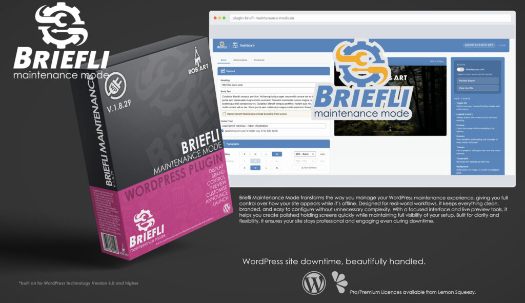
Briefli Maintanence Mode
Your WordPress paused - looking good under teh hood!
Briefli Maintanence Mode is a professional maintenance and holding screen plugin built specifically for WordPress. It gives site owners, developers, and agencies a clear, controlled way to present their site while it’s under construction, being redesigned, or temporarily offline. Instead of exposing visitors to broken pages or incomplete work, BriefliWP replaces your front end with a polished, branded experience that keeps your site looking intentional and professional at all times.
Designed for real-world use, Briefli Maintanence Mode focuses on clarity, speed, and visual control. The interface is structured around simple, intuitive panels that let you configure every aspect of your holding screen without friction. From colours and typography to messaging and layout, everything updates instantly through a live preview, allowing you to see exactly what visitors will experience before going live.
At its core, Briefli Maintanence Mode provides a reliable toggle system that instantly switches your site between live and maintenance modes. When enabled, visitors are shown your custom holding screen while a proper 503 status is sent, ensuring search engines understand the downtime is temporary. Logged-in administrators always retain full access to the live site, so work can continue uninterrupted behind the scenes.
Beyond the basics, Briefli Maintanence Mode offers flexible design control to match your brand. Built-in themes provide quick starting points, while full colour controls and gradient options allow for precise visual tuning. Typography settings, background images, and overlays give you the tools to create anything from minimal placeholders to fully branded pre-launch experiences without needing custom code.
For engagement during downtime, Briefli Maintanence Mode includes optional features such as countdown timers, social links, and email sign-up forms. These allow you to keep visitors informed, build anticipation for a launch, or capture early interest while your site is unavailable. Each feature is designed to integrate cleanly into the layout, maintaining a cohesive and professional presentation.
Advanced tools such as the Harmoniser take design further by extracting colour palettes directly from your background imagery and generating balanced colour schemes automatically. This makes it easy to create visually cohesive designs without guesswork, while still allowing full manual control when needed.
Briefli Maintanence Mode is built for people who want their WordPress site to remain presentable and purposeful at every stage of development. Whether you’re launching a new project, updating an existing site, or performing maintenance, it provides a structured, reliable way to manage downtime. With a clean interface, practical features, and a focus on visual clarity, it transforms maintenance mode from a basic placeholder into a considered part of your site experience.
Key Features
- Maintenance Toggle & 503 Handling – Instantly enable or disable the holding screen while signalling temporary downtime correctly to search engines.
- Live Preview – See your holding screen in real time before activating it for visitors.
- Built-in Themes – Apply ready-made design presets for fast setup and consistent styling.
- Full Colour Control – Fine-tune background, text, and accent colours with solid and gradient options.
- Typography Controls (Pro) – Adjust fonts, sizes, and weights for complete visual consistency.
- Background Image & Effects (Pro) – Add full-screen images, overlays, and animated backgrounds.
- Countdown Timer (Pro) – Display a live countdown to your launch date with multiple styles.
- Social Links (Pro) – Keep visitors connected by linking to your social platforms.
- Email Sign-up (Pro) – Capture early interest and build a launch list directly from your holding screen.
- Harmoniser (Premium) – Generate balanced colour palettes automatically from your background imagery.
- Saved Custom Themes (Premium) – Store and reuse your own design presets.
- Clean Admin Access – Logged-in administrators always see the live site while visitors see the holding screen.
- Lightweight & Instant – No unnecessary load, with changes reflected immediately in the preview.
- Professional Workflow Focus – Built for developers, agencies, and site owners who need control, clarity, and speed.
Requirements:
- Minimum WP Version: 6.0
- Minimum PHP Version: 7.4
- Internet Connection
- Free Version or Valid Licence for Pro Version
*Please note this plugin has the following built in languages: English
Plugin News
Briefli Maintanence Mode was rejected by WP.org!!!
Happy to say we are in the process of making and deploying a dedicated support hub. Stay tuned for more details. Their will be links posted in the plugin as well as any known locations.
Briefli Maintanence Mode continues to evolve as a modern approach to WordPress maintenance and holding page management, focusing on clarity, creative control, and real usability inside the admin environment. As maintenance plugins become essential tools for branding, communication, and user experience during downtime, Briefli Maintanence Mode is positioning itself beyond traditional maintenance-only solutions by combining live visual customisation, flexible layouts, typography controls, and presentation-focused design tools into a single streamlined interface.
Recent development has focused on improving workflow efficiency and real-time visual feedback, giving users a clearer understanding of how their maintenance experience will appear across different devices and layouts before going live. With ongoing expansion into advanced styling controls, animation systems, smarter preview functionality, and more dynamic branding tools, Briefli Maintanence Mode is steadily moving toward a more design-driven approach to WordPress maintenance—bridging the gap between technical maintenance workflows and polished visual presentation.
Changelog/Bugs
Changelog
BriefliWP - Version History
Version 1.8.0 Minor
2026-04-26- ### Added
- - **Settings page** (BriefliWP → Settings) — three-column card grid (System Info, Licence, Data & Privacy, Reset to Defaults) with right sidebar (About, Credits & Thanks, Support, Debug Information with copy-to-clipboard).
- - **Licence card** with active/inactive states, View Details modal (masked key, expiry, activated date), and Deactivate flow. Activate/deactivate AJAX handlers in `includes/core/licence.php`.
- - **Manual / Readme / Licence modals** in the main admin page sidebar — render Markdown via a lightweight in-plugin renderer, with anchor-link ToC scrolling inside the modal body.
- - **Per-style countdown capability map** (`blwp_countdown_caps()`) — single source of truth for which controls each style supports. Drives admin UI gating: irrelevant colour swatches hide, Smart-Years greys out for Premium styles, Font picker disables for Flip.
- - **Two new countdown colour controls:** `cd_card_color` (Flip card face, default `#1f1f1f`) and `cd_ring_color` (Pie ring, default `#f0c040`). Wired through to FlipDown\\\\\\\'s `.rotor`/`.rotor-leaf-*` and ProgressBar.Circle\\\\\\\'s `color` option.
- - Flip Separator colour now drives the FlipDown group dots (between Days/Hours and Minutes/Seconds).
- - Credits for vendored libraries (FlipDown / Odometer.js / ProgressBar.js — all MIT) listed in Settings sidebar.
- ### Changed
- - **Modular front-end JS** — countdown ticker, FlipDown init, Odometer init, and Status cycle/tape ticker extracted from inline `<script>` blocks in `pro/intermediate.php` into separate files under `pro/assets/js/`. Dynamic values flow through `data-*` attributes on the wrappers. Ready for minify/obfuscate at ship time.
- - **Modular CSS** — settings page and modal styles split out of the 2.6k-line `assets/admin.css` into `assets/settings.css` and `assets/modals.css`, enqueued conditionally per admin screen.
- - Static FlipDown override CSS (clearfix, seam border) moved out of inline `<style>` blocks into `assets/countdown.css`. PHP `<style>` blocks now carry only the dynamic colour values.
- - Countdown size slider remapped from `em` (parent-relative, drifted between holders) to `rem` (root-anchored, consistent across positions). New range: 0.4rem–1.6rem.
- - Flip cards resized to 1.2× FlipDown\\\\\\\'s native (612×132) with explicit dimensions instead of `transform: scale`, so the layout box matches the visual box and body text doesn\\\\\\\'t collide.
- - Flip cards now self-scale via the Size slider (10% → 100%) using `transform: scale` with a wrapper `min-height` reservation to keep the body text tight to the cards.
- ### Fixed
- - Per-style cap gating reads the picker\\\\\\\'s own hidden input (was picking up a stale mirror copy in `#blwp-status-form` and showing the wrong swatches).
- - FlipDown card-face colour override now wins (added `.flipdown` ancestor to selectors and `!important` to beat the vendored theme CSS).
- - Flip card seam reverted to a 2px black `border-top` (briefly mis-rendered as a full-bottom-half background fill).
- - Settings page header migrated from custom `.blwp-chrome` markup to the standard `.blwp-header` markup so the icon sizes match the dashboard.
- - Settings card icons (Licence, Data & Privacy, Reset to Defaults) switched from `_blue` SVG variants to base SVGs so the inverted-white filter renders them correctly on the blue card-header bar.
Version 1.7.5 Minor
2026-04-26- ### Added
- - **Three new countdown styles (Premium):**
- - **Flip Card** — split-flap solari board via vendored flipdown.js. Locked for Pro tier (lock icon, click opens upgrade overlay).
- - **Pie Circle** — animated SVG progress rings per unit via vendored progressbar.js. Days ring drains from 100% from creation date to target; hours/mins/secs cycle on their natural maxes.
- - **Odometer** — single huge running total of seconds remaining via vendored odometer.js. Numbers slide-tick like a mechanical counter.
- - `countdown_created` option auto-stamps on every target change so the Pie days ring has a fixed \\\\\\\"100% = full duration\\\\\\\" reference point.
- - Vendored libraries under `premium/assets/vendor/`: `flipdown.min.{js,css}`, `progressbar.min.js`, `odometer.min.js` + default theme. Each loads only when its style is selected.
- ### Changed
- - Countdown style picker grid now shows 4 Pro styles + 3 Premium styles (with lock icons for non-Premium). Two slots reserved for future styles in updates.
- ### Fixed
- - Save handler clamps `countdown_style` against a tier-aware allowlist server-side — Premium styles rejected for Pro/Free.
Version 1.7.4 Minor
2026-04-26- ### Added
- - **Particles** animated background (Premium) — canvas renderer with configurable count (10–200), size (1–10px), speed, particle colour, backdrop colour, and **6 shape options** (Circle, Hollow Circle, Square, Triangle, Cross, Star). Optional connecting lines between near particles. Respects `prefers-reduced-motion`.
- - **Aurora** animated background (Premium) — pure CSS, three large blurred radial-gradient blobs drifting at different speeds, three colour pickers. No JS, no library.
- - **Particles 2-column control panel** with vertical divider — left: Speed / Count / Size / Shape, right: Particle colour / Backdrop colour / Links toggle.
- - Mini Background Image preview now shows static representations of Aurora (3-blob) and Particles (chosen shape on chosen backdrop) when those types are selected.
- ### Changed
- - Animated Background type cards reordered: **Slow Zoom → Gradient Shift → Particles → Aurora** (Pro types first, Premium with lock icon after).
- - Aurora type-card thumbnail now shows three soft colour blobs (was diagonal stripes).
- - `.blwp-spin` spinbox buttons now fire both `input` AND `change` so the iframe reload pipeline picks them up alongside the live mini-preview.
- ### Fixed
- - Premium animation types are server-side rejected for non-Premium installs (was already locked in UI; now also enforced on save).
- - Animated Background subpanel listener now catches `<select>` changes too (Shape dropdown didn\\\\\\\'t update the mini preview).
Version 1.7.3 Minor
2026-04-26- ### Added
- - Card-header icons for Scheduled (daily.svg), Client Bypass (bypass.svg), Email Capture (email.svg).
- - Forest Vol. 1 (Pro) and Forest Vol. 2 (Premium) wallpaper packs with manifests.
- - Pack copyright `README.txt` in every wallpaper pack folder.
- - Font licence READMEs in `pro/assets/fonts/countdown/` and `premium/assets/fonts/` covering OFL 1.1 + Ubuntu Font Licence with per-font credit and links.
- ### Changed
- - Status size + speed now both clamp 10–100 server-side and on direct typing.
- - Countdown + Status spacing capped 0–100 (was -100…200) — Reset button still zeros instantly.
- - Logo margin top capped 0–100 (was -50…100) for consistency.
- ### Fixed
- - Email Capture controls (label, button text, style picker, mailing toggle, success/relaunch text) now drive the iframe live preview — were missing from the reload trigger list.
- - Email Capture style picker now triggers `change` after setting the hidden input value.
- - Social Style + Size + Colour + URL inputs now reload the iframe (only `social_position` was wired before).
- - Status Ticker mode + Ticker tape switching now reload the iframe — switching radios was previously a no-op.
- - Status size + speed + colour + messages fields now in reload triggers.
- - Subheading element is always rendered (CSS `:empty` hides it) so live-push has a target — typing into the field now updates the iframe in real time, not just on save.
- - Save handler clears the per-user preview stash so deleted/changed fields can\\\\\\\'t be shadowed by stale transient data.
- - Top right + Bottom right social positions now hug the right edge — `.blwp-holder { width: 100%; text-align: center }` was bleeding into the floaters.
Version 1.7.2 Minor
2026-04-26- ### Added
- - **Custom dropdown widget** for the Countdown Font picker — renders a real lock icon (`lock.svg`) on Premium-locked options instead of an emoji. Floats with `position: fixed` so it escapes any `overflow:hidden` container, repositions on scroll/resize, flips above the trigger when the viewport would clip it.
- - **Spinbox click-and-hold + scroll-wheel** — number inputs now auto-repeat after a 350ms hold (80ms cadence), and accept mouse-wheel up/down to step by the input\\\\\\\'s `step` value (only when focused, so page scroll isn\\\\\\\'t hijacked).
- - **Hard min/max clamping** for number inputs on direct typing AND on page-load (normalises previously-saved out-of-range values).
- - **Premium font pack** — 6 new countdown fonts (Bitcount Prop Single, Original Surfer, Roboto Serif, Rosarivo, Syne, Ubuntu) loaded from `premium/assets/fonts/`. Shown locked under a Premium optgroup for non-Premium installs; save handler also rejects them server-side.
- - **Margin Reset button** on Countdown + Status Spacing panels — single click zeros Top + Bottom and reloads the iframe.
- - **Logo placeholder** image (`assets/images/logo-placeholder.jpg`) renders in the admin Logo tile when none is set; `Adj.` button hides until a logo exists.
- - **BG-preview tile** shows current `bg_color` as a fallback so an empty box reads the brand colour; live-updates from Colours panel + Theme picker.
- - **Upgrade teaser cards** for the Intermediate (Pro upsell) and Advanced (Premium upsell) tabs — hero image (`assets/images/upgrade.jpg`) + curated feature list. Same hero now replaces the logo in the upgrade overlay\\\\\\\'s top-left.
- - **`BLWP_PREMIUM_URL`** constant for premium asset paths.
- ### Changed
- - **Tier gating actually gates** — Pro and Premium PHP files were being loaded purely on file existence, so a Free install with all files on disk got Pro features. Loaders in `briefliwp.php` now also check `blwp_is_pro()` / `blwp_is_premium()`.
- - **Premium-only features moved out of `pro/`** — `advanced.php`, `email-capture.php`, and `modules/scheduled.php` relocated to `premium/modules/` so they only load on Premium tier. Bypass / Email / Scheduled cards now correctly appear in Advanced (Premium) instead of leaking into Pro.
- - **Upgrade overlay renders for Pro tier too** — the gate that suppressed it for Pro was wrong (Pro users still need the Premium upsell). Only Premium suppresses it now.
- - **Countdown size scaling** uses `font-size: em` instead of `transform: scale()` — transformed elements still occupy their unscaled box, which let the heading collide with the countdown. Boxed-mode CSS converted to em units throughout. Slider mapped piecewise: 10% → 0.6em, 50% → 1em, 100% → 3em.
- - **Countdown size slider** capped at 10–100 (was unlimited up to 200%, with no lower bound enforced).
- - **Brand becomes the default palette** — defaults updated in `admin-page.php`, `maintenance-screen.php`, and the save handler. Theme card now auto-highlights by colour-matching current opts.
- - **Logo upload validator** bumped from 400px to 800px max width to avoid pixelation at large preview sizes.
- - **Iframe `sandbox` attribute removed** — the `allow-scripts + allow-same-origin` combo is a known WP.org review yellow flag, and it provided no real security here (admin-only, same-origin).
- ### Fixed
- - **Browser-locking infinite loop** on BG Remove — `pro/assets/js/animated-bg.js` had a `MutationObserver` watching `#bg-preview` whose callback mutated the same node. Added a re-entrancy guard that disconnects/reconnects around `applyToPreview`.
- - **Unchecked checkboxes weren\\\\\\\'t stashing** for the iframe preview — `serialize()` omits unchecked checkboxes, so the stash inherited the saved (often opposite) value via `array_merge`. Stash handler now explicitly zeros known toggles when absent.
- - **Spinbox `min`/`max` read from the wrong input** — admin-page.php mirrors options into a hidden status form, and the spinbox selector matched both copies; `.attr(\\\\\\\'min\\\\\\\')` returned the first match (status form, no min/max). Spinbox now scopes to `#blwp-main-form` and syncs the mirror.
- - **Custom dropdown menu was clipped** by parent `overflow:hidden` — switched to `position: fixed` with JS-positioned coordinates.
- - **Countdown style picker** wasn\\\\\\\'t updating the iframe — picker set the hidden input value but never triggered `change`.
- - **Iris colour picker** wasn\\\\\\\'t triggering `change` on its proxy input — countdown colour changes (Numbers/Labels/Separator/Box) silently failed to reach the iframe reload pipeline.
- - **`text-align`** on heading / subheading / body / copyright didn\\\\\\\'t visually do anything because flex `align-items: center` shrank each element to its content width. Typography elements now span the column.
- - **Logo / wallpaper / theme pick** now triggers `change` on the relevant inputs so the iframe reload fires; auto-disables the Animated Background subpanel and unchecks Enable when the BG is removed.
- - **Smart-years countdown flicker** — two intervals were racing on the days slot. Smart-years rendering moved into the base countdown tick so a single tick owns the DOM.
- - Countdown `Labels` toggle now properly hides labels in the iframe (was a checkbox-stash issue).
- - `Spacing` Top/Bottom changes on Countdown + Status now reload the iframe (margins were missing from the trigger list).
- - Wallpaper picker emojis (`🔒`) replaced with `lock.svg` / `lock_blue.svg`.
Version 1.7.1 Minor
2026-04-25- ### Added
- - Typography card / Images / Themes / Colours card-header icons (text / images / theme / colours).
- - Countdown / Status / Social card-header icons (timer / status / social).
- - All Typography panel adjusters (size, weight, italic, transform, decoration, align, line-height, letter/word spacing, shadow, layout reset) now drive the iframe live preview.
- ### Fixed
- - Iframe sandbox + WP.org compatibility tweaks.
Version 1.7.0 Patch
2026-04-25- ### Added
- - **Frontend layout module** (`includes/frontend/layout/`) — self-contained PHP + CSS owning the A/B/C/D region structure of the maintenance screen. Built from a standalone HTML prototype (`_dev/layout-prototype.html`) so the layout could be solved in isolation, then ported. CSS Grid 3-row container (top / 1fr / bottom) replaces the previous mix of fixed-positioned and flex layouts that kept colliding.
- - **Holder system** — every dynamic element (countdown, status, email, social) renders into a pre-placed holder. Empty holders collapse to zero size; populated ones get padding + slide-down open animation.
- - **Slow Zoom (Ken Burns)** animated background type — pure CSS `transform: scale + rotate` ping-pong on `.blwp-bg`. Speed (60s–6s), Zoom amount (2–40%), optional Twist (1.5° rotation at peak). Auto-disables when no BG image is set.
- - **Premium tier scaffolding** — new `premium/modules/` directory auto-loaded by `briefliwp.php`. Mirrors the `pro/` pattern.
- - **Harmoniser UI shell** (Premium, v0.1) — icon button at end of Themes row opens subpanel under preview with: source palette card (10 swatches), 4 harmony mode cards (Complementary / Analogous / Triadic / Split-comp), Save This Theme card with name input, user saved themes grid (max 4). Logic (palette extraction, harmony generation, AJAX save/delete) coming in v1.7.1.
- - **Mutually exclusive subpanels** — opening any of Text Controls / Logo Adjustments / Animated Background / Harmoniser closes the others and clears their `sessionStorage` flags. No more overlapping subpanels.
- - **Wiring punch list** (`_dev/WIRING_PUNCH_LIST.md`) — full audit of every admin control\\\\\\\'s post-refactor status, with a 4-phase fix order for restoring live preview on inputs that were severed by the iframe migration.
- ### Changed
- - **Iframe-based admin preview** — admin Live Preview now renders the actual live `maintenance-screen.php` inside an iframe, scaled via `transform: scale()`. Eliminates the parallel inline preview HTML and the duplicate CSS that fought with live styles. WYSIWYG is genuinely WYSIWYG.
- - **Live updates via postMessage** for text and core colour changes (heading/sub/body/footer/accent); structural changes trigger a debounced iframe reload after stashing form state to a per-user transient.
- - **Countdown position renamed** `before_heading` → `after_subheading` (renders between subheading and body). Back-compat filter auto-migrates saved settings on next save.
- - **Animated background type cards** — Slow Zoom thumbnail now shows the actual chosen BG image when available; type cards mutually hide their per-type Controls cards on selection.
- - **Harmoniser button height** — auto-stretches to match adjacent theme cards via `align-self: stretch`.
- - **Mini Images preview** restores BG image when switching from Gradient Shift to Slow Zoom (was staying hidden).
- ### Fixed
- - Status messages, countdown, email, social no longer collide via shared `blwp_screen_after_body` hook — each has its own dedicated hook + holder
- - Countdown (Bold / Boxed) no longer overlaps the next element below — holder padding is collision-proof
- - Decorative rule auto-hides only when countdown is at the `slip` position (not `before_heading`/`after_subheading`)
- - Animated Gradient Shift smooth rotation via `transform: rotate()` instead of stepping through `linear-gradient(angle)` keyframes
- - Static BG image and dark vignette suppressed when Gradient Shift animation is on for vibrant colour fidelity
- ### Removed (dead code cleanup)
- - `updateCountdownPreview`, `updateStatusPreview`, `updateLogoPreview`, `updateSocialPreview`, `updateEmailPreview` from `admin.js` (~370 lines) — iframe handles rendering
- - `.blwp-preview-page`, `.blwp-preview-holder`, `.blwp-screen-content`, `.blwp-screen-rule`, `.blwp-screen-overlay`, `.blwp-screen-logo-inline`, `.blwp-screen-sitename`, `.blwp-screen-branding`, `.blwp-screen-footer`, duplicate `.blwp-countdown*` rules, preview-only social and email mini-preview CSS, preview-only animated-bg overrides from `admin.css` (~400 lines)
- - Inline layout CSS in `maintenance-screen.php` (~200 lines) — moved to `layout.css`
- - Legacy social `position: absolute; bottom: 150px` rules from `social.css` — holders own positioning now
Version 1.6.0 Minor
2026-04-25- ### Changed
- - **Iframe-based admin preview (single source of truth)** — admin Live Preview now renders the actual live maintenance screen inside an iframe (`?briefli-preview=1&iframe=1`), scaled via `transform: scale()`. Eliminates the parallel inline preview HTML and the duplicate CSS rules that fought with live styles. WYSIWYG is now genuinely WYSIWYG.
- - **Live updates via postMessage** — text and colour changes push instantly into the iframe without reload; structural changes (countdown position, animation toggle, BG image, etc.) trigger a debounced reload after stashing the form state to a per-user transient.
- - **Holder-based layout** — replaced free-floating `do_action()` injection with always-present holders (`.blwp-holder--above-logo`, `--slip`, `--before-heading`, `--after-body`, `--status`, `--email`, `--top-right`, `--bottom-right`, `--bottom-centre`). Empty holders collapse to zero space; populated holders get padding + slide-down open animation. Each module fires into its dedicated hook, no slot collisions.
- - **New hooks**: `blwp_screen_email`, `blwp_screen_status`, `blwp_screen_top_right`, `blwp_screen_bottom_right`, `blwp_screen_bottom_centre` — each with its own holder. Email and status no longer share `blwp_screen_after_body` with countdown.
- ### Fixed
- - Countdown (Bold / Boxed) no longer overlaps email capture or following content — holder padding (`20px 0`) is now collision-proof, and the countdown itself has `padding-bottom: 10px` baked in
- - Status message (Cycle mode) text properly centred — absolute-positioned spans anchored `left:0; right:0; text-align:center`
- - Decorative rule auto-hides when countdown takes the `slip` or `before_heading` position
- - Animated background fully visible — static BG image and dark vignette suppressed when animation is on; smooth gradient rotation via `transform: rotate()` instead of stepping through angle keyframes
Version 1.5.2 Minor
2026-04-25- ### Added
- - **Animated Background module — Gradient Shift** — full-width \\\\\\\"✦ Animated Background\\\\\\\" button under the BG media buttons opens a subpanel below the live preview (same `sessionStorage`-persisted pattern as Text Controls); 4-card type picker (Gradient Shift active; Particles, Aurora, Slow Zoom marked Coming Soon); per-type controls card with right-aligned **Enable** toggle, Speed spinbox (10–100 = slow→fast), and native Colour A / Colour B pickers with live hex labels
- - **Smooth gradient rotation** — single oversized inner div rotated via `transform: rotate()` (animatable) instead of cycling `linear-gradient(angle)` keyframes (which snap); duration 6s–60s mapped from speed
- - **Live preview integration** — big preview shows the rotating animation matching live frontend exactly; static BG image and dark vignette hidden when animation is on for vibrant colour fidelity
- - **Mini Images preview & Type card thumbnail** — show static gradient (Colour A → Colour B at 135°) reflecting current colour choices; no animation overhead in small previews; ↻ icon hint on type card
- - **Frontend rendering** — `blwp_screen_head` injects `@keyframes blwpAnimGSRotate` and `.blwp-anim-overlay::before` styles; `blwp_screen_top` outputs the overlay div after `.blwp-bg`; `.blwp-bg { display: none }` injected when animation is on so the static image doesn\\\\\\\'t bleed through
- - **Tab switch cleanup** — Animated BG panel hides and its `sessionStorage` flag clears when leaving the Basic tab (same behaviour as Text Controls / Logo Adjustments)
- ### Fixed
- - Enable label in subpanel card headers now reads brand blue + bold (was white-on-light-grey, invisible)
- - Big preview content (heading, body, etc.) stays vertically centred when animation is active — `z-index: 2` only, no `position: relative` override that broke `.blwp-screen-content`\\\\\\\'s `inset: 0` flex centring
- - Type card thumbnails sized to fixed `60px` height (was `aspect-ratio: 16/9` rendering huge)
Version 1.5.1 Minor
2026-04-25- ### Added
- - **Countdown Years module** — Display radio (Days / Smart) under the Size row in the Countdown Timer card; Smart mode injects a Years unit before Days in both the admin preview and frontend when the target date is more than days-left-in-year away; built as a standalone Pro module (`pro/modules/countdown-years.php` + `pro/assets/js/countdown-years.js`)
- - **Scheduled On/Off** — Advanced tab card with Go Live / Go Off datetime pickers (site timezone); WP-Cron auto-activates and deactivates the maintenance screen; runtime window check covers cron latency; completely independent of WP update mode
- - **Social links clear button** — ✕ button appears at end of each filled social URL input; clears field and triggers sort/preview update; brand-blue hover state
- - **Social row visibility** — all empty rows visible when fewer than 4 URLs filled; all empty rows hidden when max 4 reached; clearing a filled row from max-4 restores empty slots immediately
- ### Fixed
- - **Status message (Cycle mode) left-justified on frontend** — absolute-positioned message spans now anchored `left:0; right:0; text-align:center` with container set to `width:100%`
- - **Scheduled card note margin-top** — first `<p>` inside card body zero\\\\\\\'d to remove excess top gap
Version 1.5.0 Minor
2026-04-24- ### Added
- - **Status Messages card** — up to 5 messages each with individual enable checkbox and 55-character input; single-select (radio) mode for static display, or enable Ticker for multi-message animation
- - **Ticker modes** — Cycle (opacity crossfade, configurable speed) and Ticker Tape (continuous horizontal scroll, configurable speed); tape clips to content-block width matching the frontend layout exactly
- - **Status right-column controls** — Separator dropdown (• / | * – ~), Size spinbox (60–200%), Speed spinbox (10–90%), Colour swatch, and collapsible Spacing margin panel; all matching Countdown card layout
- - **Status preview slot** — live preview updates on every control change; tape uses full slot width with `overflow:hidden` cropping; cycle crossfades in preview
- - **Position conflict detection** — \\\\\\\"After body\\\\\\\" countdown position auto-disabled when Status Messages is also enabled (avoids overlap)
- - **Spinbox min/max enforcement** — `+`/`−` buttons now clamp to the input\\\\\\\'s `min`/`max` attributes (fixes Speed and all other spinboxes)
- - **Ticker description layout** — Cycle/Tape option descriptions wrap to a second line beneath the label for clarity
- ### Fixed
- - Status card two-column layout: separated JS toggle wrapper from flex container so `display:block` toggle doesn\\\\\\\'t override `display:flex`
- - Tape restart: `pos = 0` (right edge of container) on loop restart for seamless looping without gap
- - Status slot width: tape now measures and clips to the 680px content block, not the full preview width
- - Spacing button on Status card now matches Countdown card style (`button blwp-style-btn`, `adjustments.svg` icon)
Version 1.4.0 Minor
2026-04-24- ### Added
- - **Pro Countdown Timer** — four styles (Bold with `|` separators, Minimal with `:`, Inline text, Boxed squares), four positions (Above logo page top, Slip, Before heading, After body), live ticking in admin preview
- - **Countdown font picker** — five bundled web fonts (Jost, Domine, Trocchi, Pangolin, Oxanium) plus Default page font; font preview strip shows `12 : 34 : 00` in selected font
- - **Countdown colour swatches** — four Iris colour pickers (Numbers, Labels, Separator, Box) using same floating overlay pattern as Basic tab; colours applied live to preview and frontend via inline styles
- - **Countdown size control** — `+`/`−` spinbox (40–200%) under Position scales the entire countdown via `transform: scale()` without affecting `rem` resolution
- - **Countdown margin control** — Top/Bottom spinboxes in collapsible Spacing panel; applied to preview and frontend
- - **Tab persistence** — active tab (Basic/Intermediate/Advanced) survives save via `?tab=` query param; page reloads directly onto the correct tab
- - **Subpanel auto-close** — Logo Adjustments and Text Controls subpanels close automatically when switching away from Basic tab
- - **Frontend CSS injection** — `countdown.css` loaded via `blwp_screen_head` action hook inside the maintenance screen `<head>`; not dependent on `wp_head`
- ### Fixed
- - **Preview `rem` sizing** — set `font-size: 16px` on `.blwp-preview-page` so countdown `rem` values resolve identically to the frontend (WordPress admin sets 13px root)
- - **Above-logo position** — moved `blwp_screen_above_logo` hook outside `.blwp-inner` to be a direct child of `.blwp-wrap` so `position: absolute; top: 40px` is relative to the full-height container, not the content box
- - **Countdown label class conflict** — admin form `.blwp-cd-label` rule (with `flex: 0 0 72px`) scoped to `.blwp-cd-row` so it no longer bleeds into preview countdown unit labels
- - **Preview slot centering** — `.blwp-preview-slot` given `width: 100%; display: flex; justify-content: center` so countdown sits centred in the content column
Version 1.3.0 Minor
2026-04-24- ### Added
- - **Preset theme picker** — four one-click themes (Dark, Light, Minimal, Brand) displayed as visual cards between Images and Colours; each card shows the background colour as a large swatch and the five text/accent colours as vertical strips; clicking floods all colour fields and updates the live preview instantly
- - **Free tier complete** — all Basic controls, WYSIWYG preview, wallpaper picker, per-element colours, typography controls, and preset themes are now fully implemented
Version 1.2.2 Minor
2026-04-24- ### Added
- - **True WYSIWYG preview** — preview now renders at the actual live browser viewport dimensions (`visualViewport.width × height`) then scales down as a single unit via `transform: scale()` with `transform-origin: top left`; all font sizes, spacing, logo size, branding, and footer positions are identical to the live screen — no per-element size calculations needed
- ### Fixed
- - **Logo size mismatch** — logo wrap constrained to `max-width: 680px` (matching `.blwp-inner` on the live screen) so `width: X%` on the logo image resolves to the same pixel size in both preview and live
- - **Preview layout values** — padding, rule dimensions, content max-widths, branding position, and footer position updated to exact live-screen values; previously used scaled-down approximations
Version 1.2.1 Minor
2026-04-24- ### Added
- - **Section icons** — SVG icons in Dashboard header, Content card, Live Preview card header, Text Controls button and subpanel header, Logo Adjustments subpanel header, and Layout button inside Text Controls
- - **WP core maintenance override** — `enable_maintenance_mode` filter suppresses WordPress\\\\\\\'s own maintenance screen when BriefliWP is active
- ### Fixed
- - **Logo width scaling** — `width: X%` + `max-width: 100%` correctly upscales logos beyond their intrinsic pixel size on the live screen
- - **Adj. button active state** — blue background now applies correctly (WP `.button` class overrides resolved with `!important`)
- - **Adj. panel persistence** — Logo Adjustments panel survives saves via `sessionStorage`, same as Text Controls
- - **Logo size controls** — range sliders now correctly call `updateLogoPreview()` and pass live values directly, bypassing stale `mfVal` reads
- - **Logo max-height removed** — replaced with max-width only; height was conflicting and causing confusion
- - **Text Controls icon** — Layout button inside Text Controls now uses `adjustments.svg` instead of Unicode placeholder square
- - **Btn icon visibility** — `.blwp-btn-icon` uses `brightness(0)` (dark) when inactive, flips to white on hover/active
Version 1.2.0 Minor
2026-04-24- ### Added
- - **Per-element colour pickers** — individual colours for Heading, Subheading, Body Text, Accent, and Footer; replaces shared text colour
- - **Floating colour overlay** — pickers open in a fixed tooltip panel above each swatch, detached to `<body>` to avoid clipping; never stretches the UI inline
- - **Gradient background** (Premium) — toggle in the Background colour overlay reveals a second colour picker and direction selector (Top→Bottom, Left→Right, Diagonal, Radial); applied both in admin preview and frontend screen
- - **Hover / Active colours** (Pro) — small toggle per swatch reveals hover and active colour pickers for future interactive element states
- - **Layout overlay** — margin and padding controls per text element (Heading, Subheading, Body, Copyright); triggered by a Layout button in each Text Controls card; T/R/B/L number inputs with spinbox +/− buttons, link-all-sides toggle (on by default), and reset-to-zero button; live preview updates instantly
- - **Text Controls sub-panel** — typography controls per element: Transform, Decoration, Align, Letter spacing, Word spacing, Line height (Body only), Text shadow; slides in below the live preview
- - **Typography weight dropdown** — 100–900 weight selector (Thin → Black) per element in the Typography card
- - **Italic toggle** — per-element italic button in the Typography card
- - **Sub-panel persistence** — Text Controls panel stays open after Save via `sessionStorage`
- - **Dev licence bypass** — `BLWP_DEV_KEY` / `BLWP_DEV_TIER` constants in `wp-config.php` mirror the pattern used by other Rob Art plugins
- ### Changed
- - Heading colour in live preview and frontend now reads `heading_color` instead of shared `accent`
- - All text styling and colour controls update the live preview instantly without saving
- - Frontend `maintenance-screen.php` applies per-element colours, gradient background, margin/padding, and all text controls via inline CSS helpers
- - Save bar now shows a second Preview Screen button alongside Save Settings
- ### Fixed
- - Duplicate hidden status-form inputs causing preview reads to return stale saved values; fixed by scoping all JS reads to `#blwp-main-form`
- - Text align and slider controls not updating preview live
- - Preview element alignment fixed by `width: 100%; max-width: 420px` on h2/h3/p so text-align operates on a fixed-width box
- - Copyright footer now constrained to same max-width as other text elements so alignment controls work correctly
- - Colour overlay proxy inputs planted inside `#blwp-main-form` after `$mf` is defined, preventing `Cannot read properties of undefined` crash on load
Version 1.1.0 Minor
2026-04-23- ### Added
- - Modular file structure: `includes/core/`, `includes/admin/`, `includes/frontend/`, `includes/pages/partials/`, `includes/partials/`.
- - Licence module (`includes/core/licence.php`) with HMAC-signed records and dev bypass.
- - Pack scanner (`includes/core/packs.php`) — scans `/packs/` for drop-in wallpaper and theme bundles via `pack.json` manifests; built-in wallpaper helper for shipped assets.
- - Auto-loading `/pro` folder — any `.php` in `/pro/` is required on load; shows `pro-installer.php` fallback when absent.
- - Upgrade overlay (`includes/partials/upgrade-overlay.php`) — two-column modal with pricing tiers and licence entry, triggered by any `.blwp-upgrade-trigger`.
- - `blwp_is_pro()` / `blwp_is_premium()` gate helpers used throughout the admin UI.
- - Wallpaper picker modal (`includes/partials/wallpaper-picker.php`) — brand-blue header with pack name, 4-column 16:9 grid, scrollable body, closes only via X or selection. Placeholder slot per pack for upgrade CTAs or pack metadata.
- - 20 default wallpapers shipped in `assets/wallpapers/`.
- - \\\\\\\"Choose BG\\\\\\\" button on the Background Image field opens the picker and injects the selected wallpaper URL into the live preview.
- - Hidden `bg_url` field alongside `bg_id` so pack wallpapers persist without requiring Media Library sideloading.
- - Remove-branding checkbox (Pro real checkbox, Free opens the upgrade overlay) with Pro badge.
- - `admin_footer` hook renders the upgrade overlay and wallpaper picker on the plugin page.
- ### Changed
- - Sidebar status toggle now submits the hidden form on change so maintenance mode persists immediately.
- - Sidebar toggle turns vivid green (`#22c55e`) when Maintenance is ON; main `.blwp-toggle` stays brand blue.
- - Media-field buttons (Choose / Change / Remove / Choose BG) are now equal-width in a flex row spanning the preview width, with a 6px gap.
- - Media buttons simplified to \\\\\\\"Choose\\\\\\\" / \\\\\\\"Change\\\\\\\" (the field label above makes the context obvious).
- - Saved notice now collapses its height and padding at the end of the fade animation so no empty gap is left behind.
- - `maintenance-screen.php` and admin page honour `bg_url` when no Media Library `bg_id` is set.
- - Save handler persists `bg_url` and exposes `blwp_save_settings` filter for Pro modules.
- ### Fixed
- - Sidebar toggle slider was not animating — the `:checked` CSS only targeted `.blwp-toggle`; extended to `.blwp-sidebar-toggle` as well.
- - Duplicate Remove buttons no longer inserted when re-selecting media.
Version 1.0.0 Major
2026-04-15- - Maintenance mode with 503 status and Retry-After header.
- - Logged-in users and admin preview always see the real site.
- - Branded holding screen: heading, subheading, body, footer, logo, background image, colour pickers, typography presets.
- - Admin dashboard with Basic / Intermediate / Advanced tabs and live viewport-matched preview.
Bugs
BriefliWP - Known Issues
No known issues at this time.
Updates
BriefliWP - Latest Update
Release Notes:
- ### Added
- - **Settings page** (BriefliWP → Settings) — three-column card grid (System Info, Licence, Data & Privacy, Reset to Defaults) with right sidebar (About, Credits & Thanks, Support, Debug Information with copy-to-clipboard).
- - **Licence card** with active/inactive states, View Details modal (masked key, expiry, activated date), and Deactivate flow. Activate/deactivate AJAX handlers in `includes/core/licence.php`.
- - **Manual / Readme / Licence modals** in the main admin page sidebar — render Markdown via a lightweight in-plugin renderer, with anchor-link ToC scrolling inside the modal body.
- - **Per-style countdown capability map** (`blwp_countdown_caps()`) — single source of truth for which controls each style supports. Drives admin UI gating: irrelevant colour swatches hide, Smart-Years greys out for Premium styles, Font picker disables for Flip.
- - **Two new countdown colour controls:** `cd_card_color` (Flip card face, default `#1f1f1f`) and `cd_ring_color` (Pie ring, default `#f0c040`). Wired through to FlipDown\\\\\\\'s `.rotor`/`.rotor-leaf-*` and ProgressBar.Circle\\\\\\\'s `color` option.
- - Flip Separator colour now drives the FlipDown group dots (between Days/Hours and Minutes/Seconds).
- - Credits for vendored libraries (FlipDown / Odometer.js / ProgressBar.js — all MIT) listed in Settings sidebar.
- ### Changed
- - **Modular front-end JS** — countdown ticker, FlipDown init, Odometer init, and Status cycle/tape ticker extracted from inline `<script>` blocks in `pro/intermediate.php` into separate files under `pro/assets/js/`. Dynamic values flow through `data-*` attributes on the wrappers. Ready for minify/obfuscate at ship time.
- - **Modular CSS** — settings page and modal styles split out of the 2.6k-line `assets/admin.css` into `assets/settings.css` and `assets/modals.css`, enqueued conditionally per admin screen.
- - Static FlipDown override CSS (clearfix, seam border) moved out of inline `<style>` blocks into `assets/countdown.css`. PHP `<style>` blocks now carry only the dynamic colour values.
- - Countdown size slider remapped from `em` (parent-relative, drifted between holders) to `rem` (root-anchored, consistent across positions). New range: 0.4rem–1.6rem.
- - Flip cards resized to 1.2× FlipDown\\\\\\\'s native (612×132) with explicit dimensions instead of `transform: scale`, so the layout box matches the visual box and body text doesn\\\\\\\'t collide.
- - Flip cards now self-scale via the Size slider (10% → 100%) using `transform: scale` with a wrapper `min-height` reservation to keep the body text tight to the cards.
- ### Fixed
- - Per-style cap gating reads the picker\\\\\\\'s own hidden input (was picking up a stale mirror copy in `#blwp-status-form` and showing the wrong swatches).
- - FlipDown card-face colour override now wins (added `.flipdown` ancestor to selectors and `!important` to beat the vendored theme CSS).
- - Flip card seam reverted to a 2px black `border-top` (briefly mis-rendered as a full-bottom-half background fill).
- - Settings page header migrated from custom `.blwp-chrome` markup to the standard `.blwp-header` markup so the icon sizes match the dashboard.
- - Settings card icons (Licence, Data & Privacy, Reset to Defaults) switched from `_blue` SVG variants to base SVGs so the inverted-white filter renders them correctly on the blue card-header bar.
Download:
Requires: WordPress 6.2+ · PHP 8.0+
Documentation and Tutorials
Additional Learning Resources
For Plugin specific Help & Documentation visit this page.
A detailed PDF User Guide is available for download using the link provided below. This document explains all key features and functions of the plugin, helping you become familiar with its tools and workflow so you can make the most of your creative process.
For hands-on demonstrations and walkthroughs, visit our YouTube channel, where a full series of video tutorials cover everything you need to get started with the app. These videos provide visual guidance, practical examples, and helpful tips to ensure a smooth and productive learning experience.
To stay updated with new tutorials, feature overviews, and upcoming releases, subscribe to the channel here: RobArt Illustration
PDF User Manual Link(s) English